13 June 2010

Final Submission-Photos

SITE MODEL


This shows that this building fits into the busy, bohemian, buildings of King St.

LIGHT PHOTOS


This shows how light enters on both the ground level and the first floor.

Final Submission


Concept

ENTRANCE:
  • Facade is created that is similar to all the buildings that are on King St.
  • Does not stand out and hence, the building does not seem 'random'.
  • However, the facade is cut a little, to make this building different to King St.
  • This cut allows the public to enter the gallery, in a more 'secretive' way.
  • Angle of facade allows the public to enter into this building in 'curiosity'.
  • The only main glimpses that the public can see is through the cut of facade.
  • The large scale wall (that starts from the entrance) is a guide to show the length of the building and to also emphasize the laneway.
PUBLIC AND PRIVATE SPACES:
  • The public space is the art gallery and is at the front of the site.
  • The private spaces (apartment, office, studio, storage space) is on the otherside.
  • However, although they are separated they are similar in rooms, making each room/space not random
  • The public space and private spaces are divided by walls
MOVEMENT/CIRCULATION THROUGH THE BUILDING:
  • The main movement/circulation through the building is through the stairs and open spaces in each rooms
NATURAL LIGHTING:
  • Light enters the first floor level through the gaps of the walls, allowing large amounts of light to enter the rooms.
  • Light that enters the ground floor is through the gaps on the first floor level.
  • Courtyards are open, hence light is already exposed in these areas
  • The stairs (the walkway) are exposed to the light, as there is no roof at these walkways
  • Glazing of light also enters the private spaces of this building

Concept Development


Using SketchUp

18 May 2010

Client, Narrative + Artist

Client
A young, bohemian woman. Start of a new business. Already lived in Newtown (hence, wants to incorporate her culture into the building). Believes society should be open and welcome into her gallery, but should not stand out from the facades of other buildings on King St. Prefers paintings over sculptures. She believes the artwork is more of important than the building.

Narrative

"an INDEPENDENT GALLERY for a YOUNG WOMAN in search of ARTISTS that
MANIPULATES TEXTURES manufacturing VIBRANT ILLUSTRATIONS for an
EASYGOING & BOHEMIAN society."

Artist

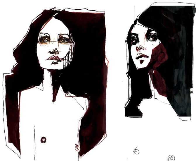
Paintings/Sculptures. The art style chosen is based around the ideas of using different textures/materials order to illustrate a meaningful artwork. Stina Persson focuses on this style using:
  • Water colour


  • Cut paper


  • Edgy textures


  • Photos


  • Acrylic Ink


Personality and meaning is incorporated in these artworks. These artworks bring upon emotions and focusing on the idea of a social and cultural diversity environment (emphasis on different faces are seen in each artwork)

Site Analysis

ON GOOGLE MAP
SITE


SITE


SURROUNDING BUILDINGS

TRAFFIC


PERSPECTIVE OF THE SITE


INTERIOR OF THE SITE


BACK OF THE SITE


PARK AND BACK OF THE SITE


PUBLIC CARPARK AND CONNECTION WITH THE SITE

Project 3-Gallery in Newtown

PROJECT 3

Bohemian Simplicity.
Sydney's bohemian city.
Growth from the late 20th C.
Full of artists from illustrations to sculptures.
Relaxed and open atmosphere.
Main district King street.
King street contains bookshops, vintage shops, music stores, restaurants, and now a gallery.


http://sydney.zpages.com.au/userimages/user06_1139282903.jpg

09 May 2010

Reflection

Pros
1. POCHE: Much more neater and precise in comparison to Project 1. Poches hopefully focus on the depth of the building, allowing visual communication to be successful.
2. PHOTOS OF MODEL: Although the model being slightly to the awkward scale, the photos make the model visually pleasing.
3. NARRATIVE SENTENCE: The narrative sentence, goes from the painting to the sentence to the typology to the design, making my design much more successful. It also communicates all of the relationships that were previously stated.


Cons
1.
MODEL: Looks a bit unusual. For the next project, start the model earlier to be more precise and neat.
2. PRESENTATION: To make the presentation neater, use photoshop to allow each sheet to look consistent
3. PERSPECTIVES: There are no perspectives, to get a better understanding of the idea, there is a need to show perspectives to allow the viewer to feel that he/she is in the building.
4. BLOG: Hardly much text, need to show progression during every week

Final Model


Followers